
As Creative Director of Men's Health, I oversaw all aspects of the brand, from the website to the print edition and even events. I managed a team of 11 cross platform art directors, photo editors and designers who are responsible for the work you see here.
My biggest achievement? Knocking down the traditional barriers between print, digital, editorial, and marketing in order to create a visually cohesive product. One that was nominated in 2017 for an ASME in design, for the first time in MH's history!


Case study: Redesign
The problem: What does it mean to be a Men’s magazine today? The role of a man has become increasingly complex in recent years, and as a result, Men’s Health needed to grow. How do we encourage someone to pay for our magazine in this era?
A little background:
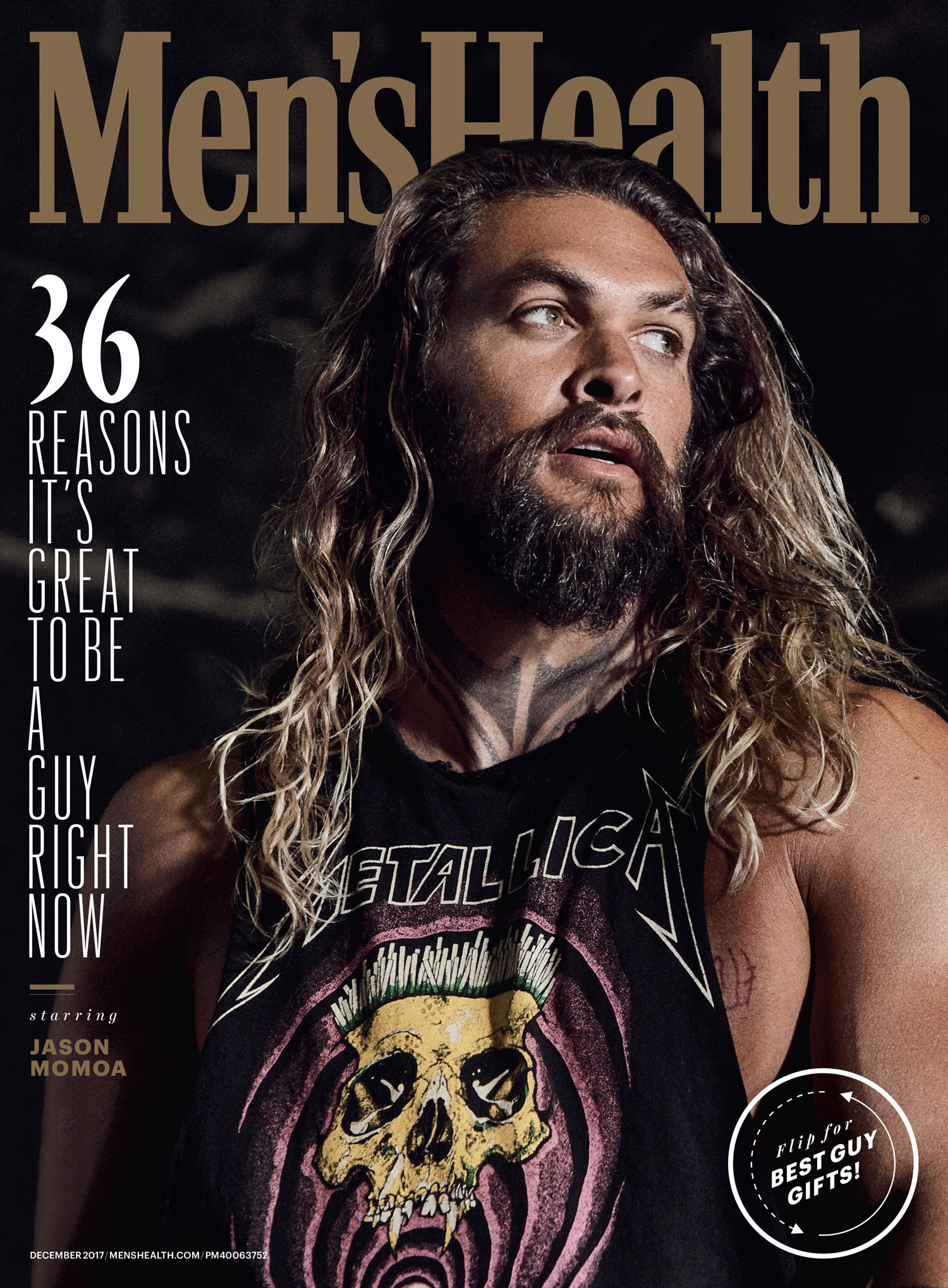
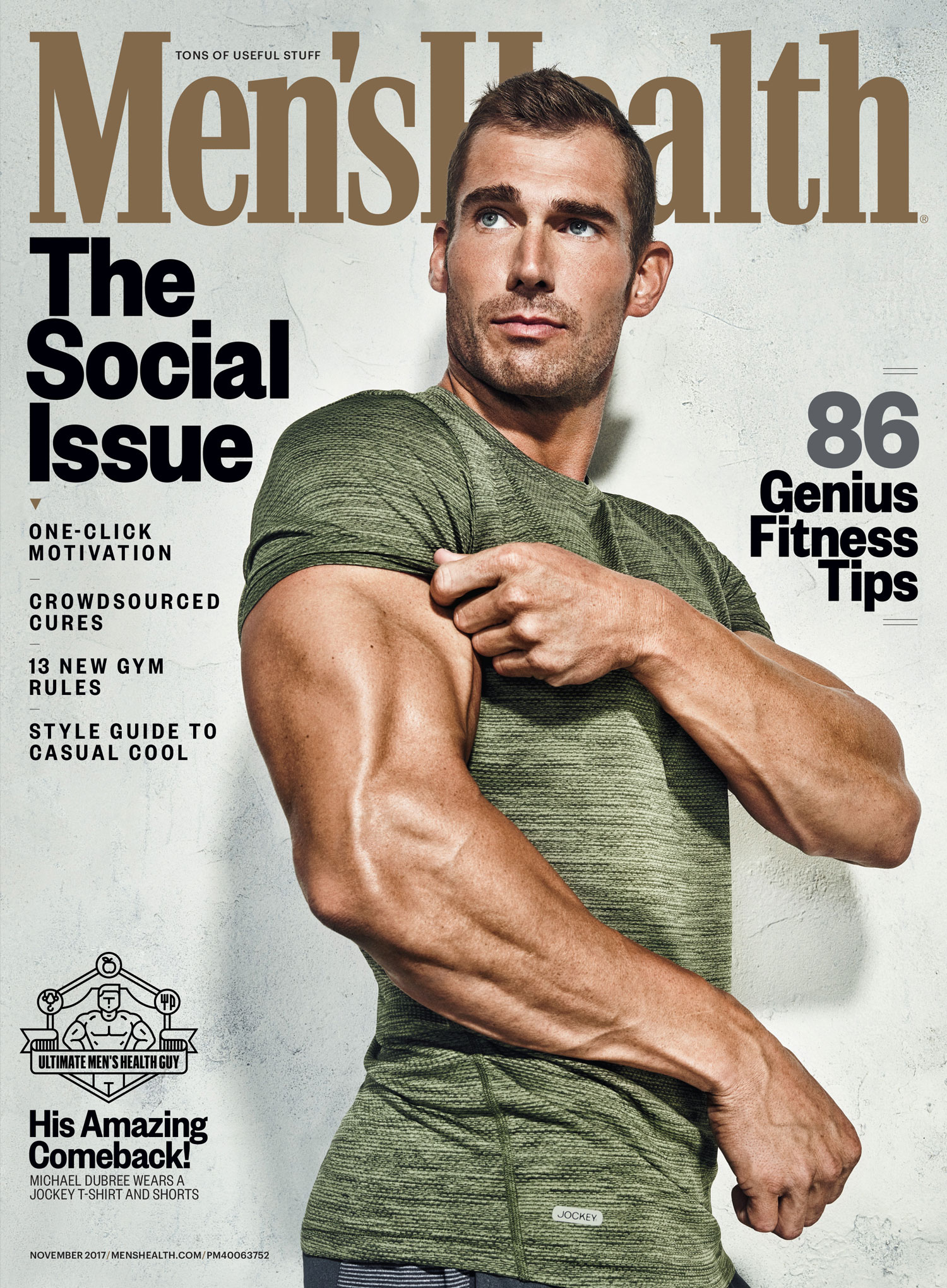
Since 1987, Men’s Health has been the manual for improving a man’s life. Today, our reader is a median age of 45, and has a significant household income. But he has changed much since the 80’s. He is no longer concerned solely with jogging and pumped up biceps, but rather biohacking and full self-optimization. He’s not afraid to be sensitive. He loves to cook, just doesn’t have a lot of time to. We needed a redesign that would sell our decades of knowledge to that sophisticated and complex male.
Photography
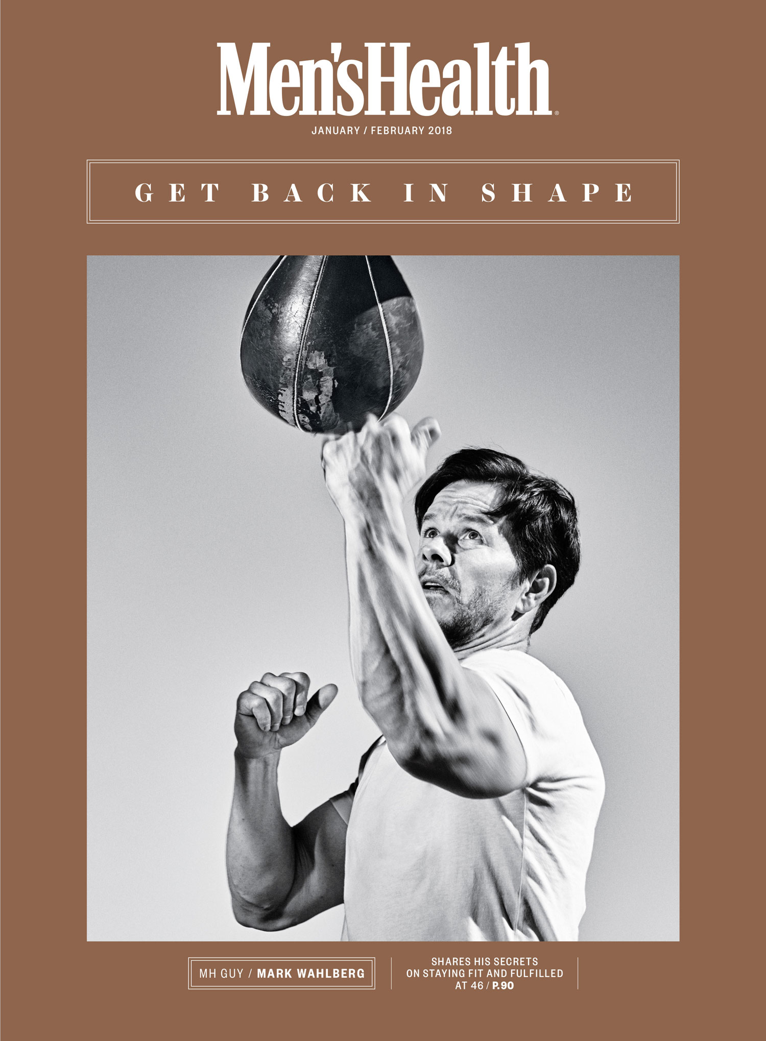
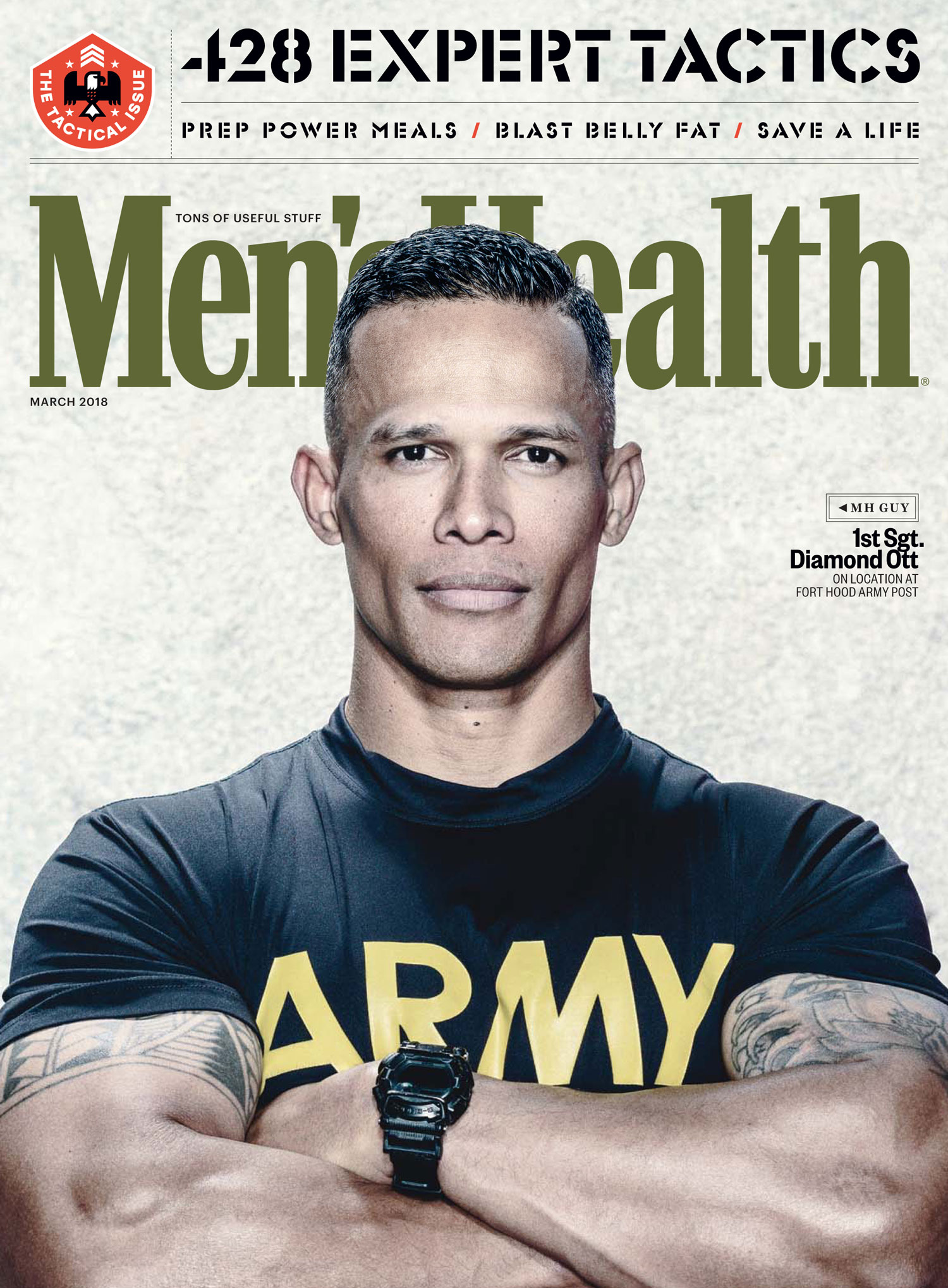
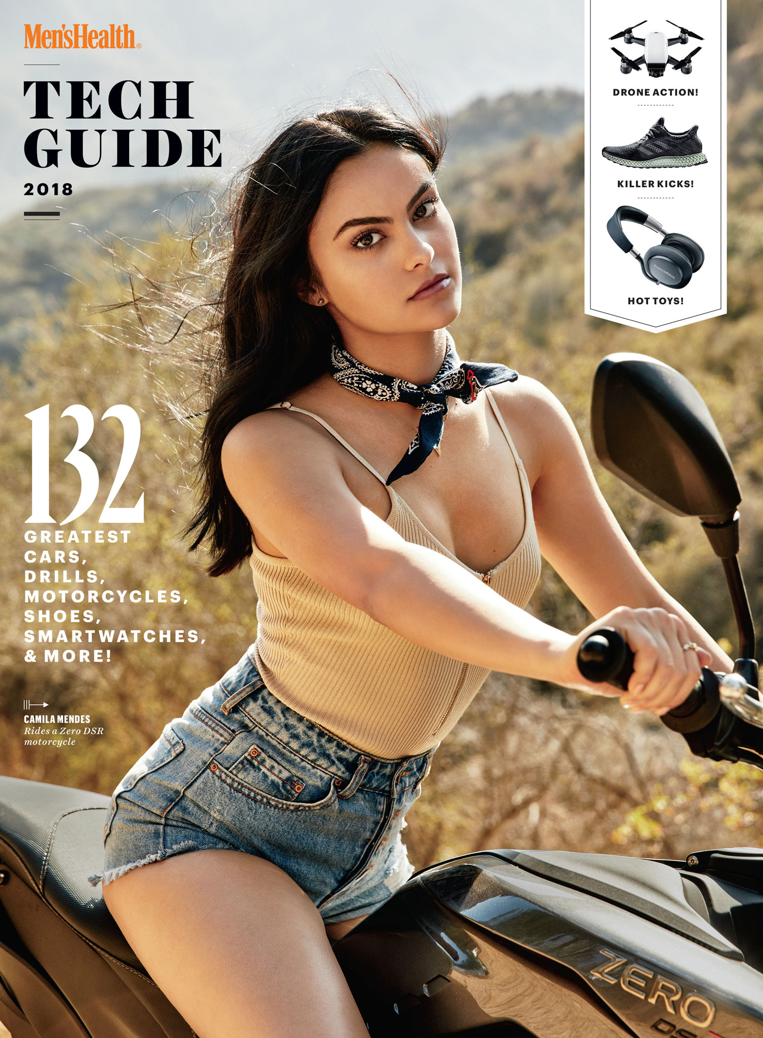
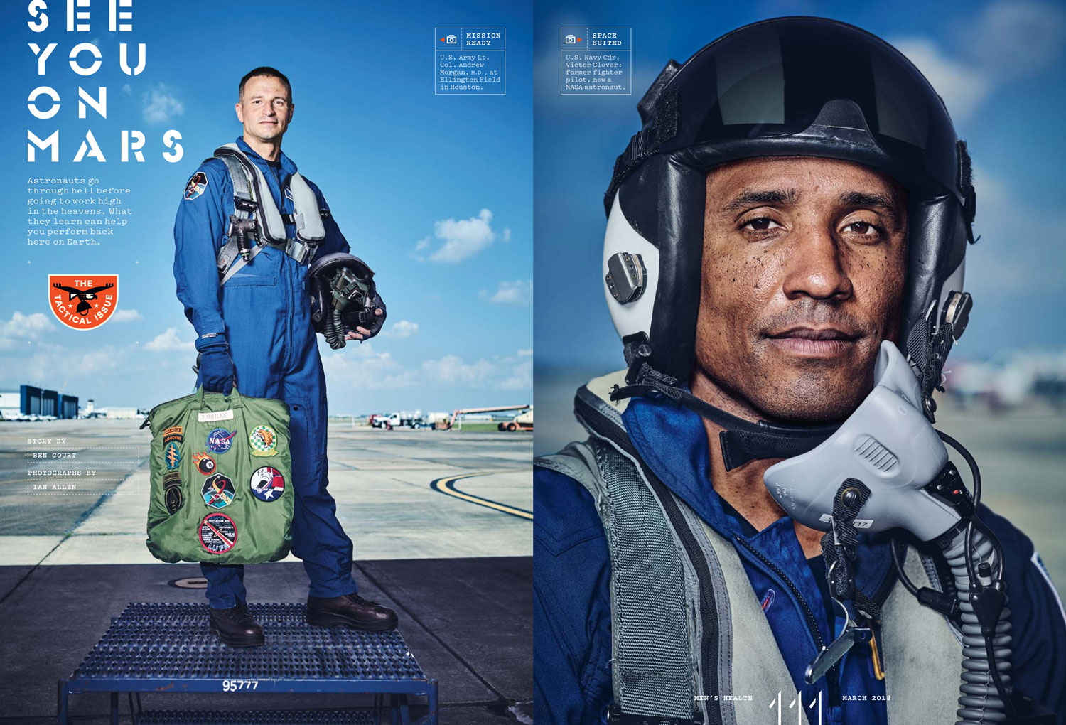
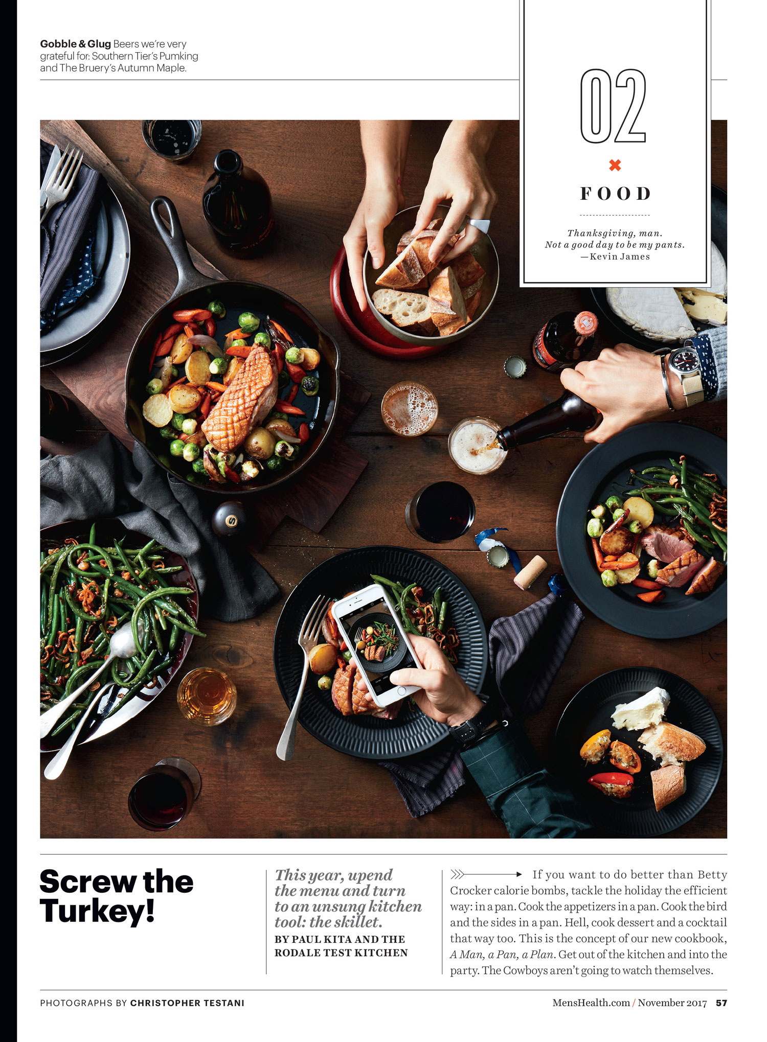
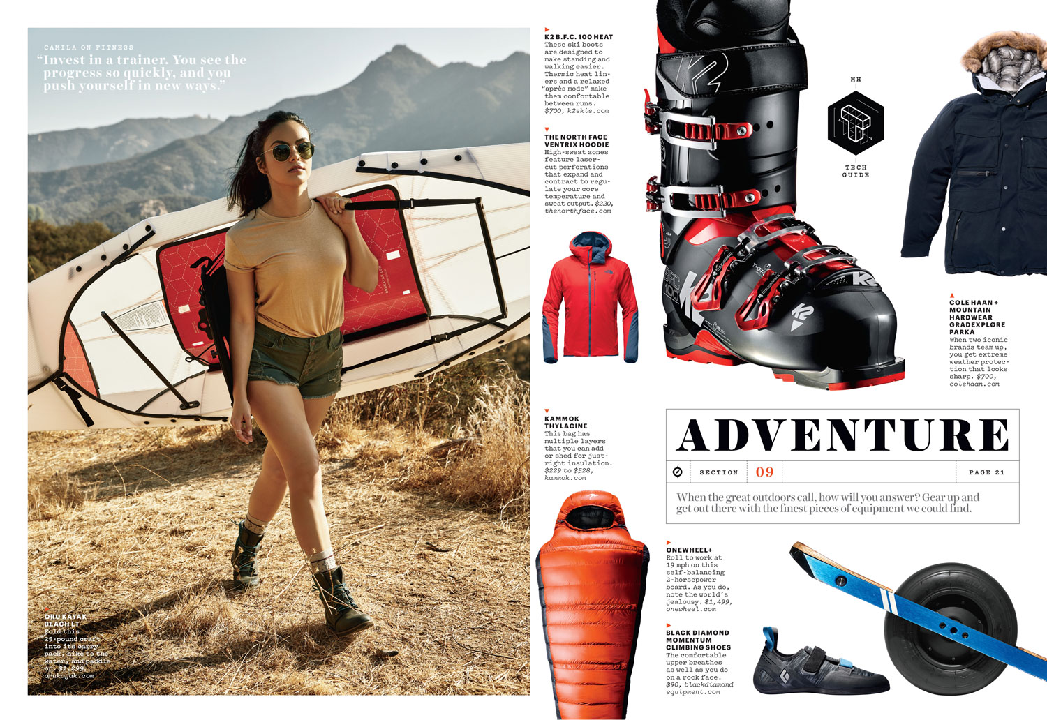
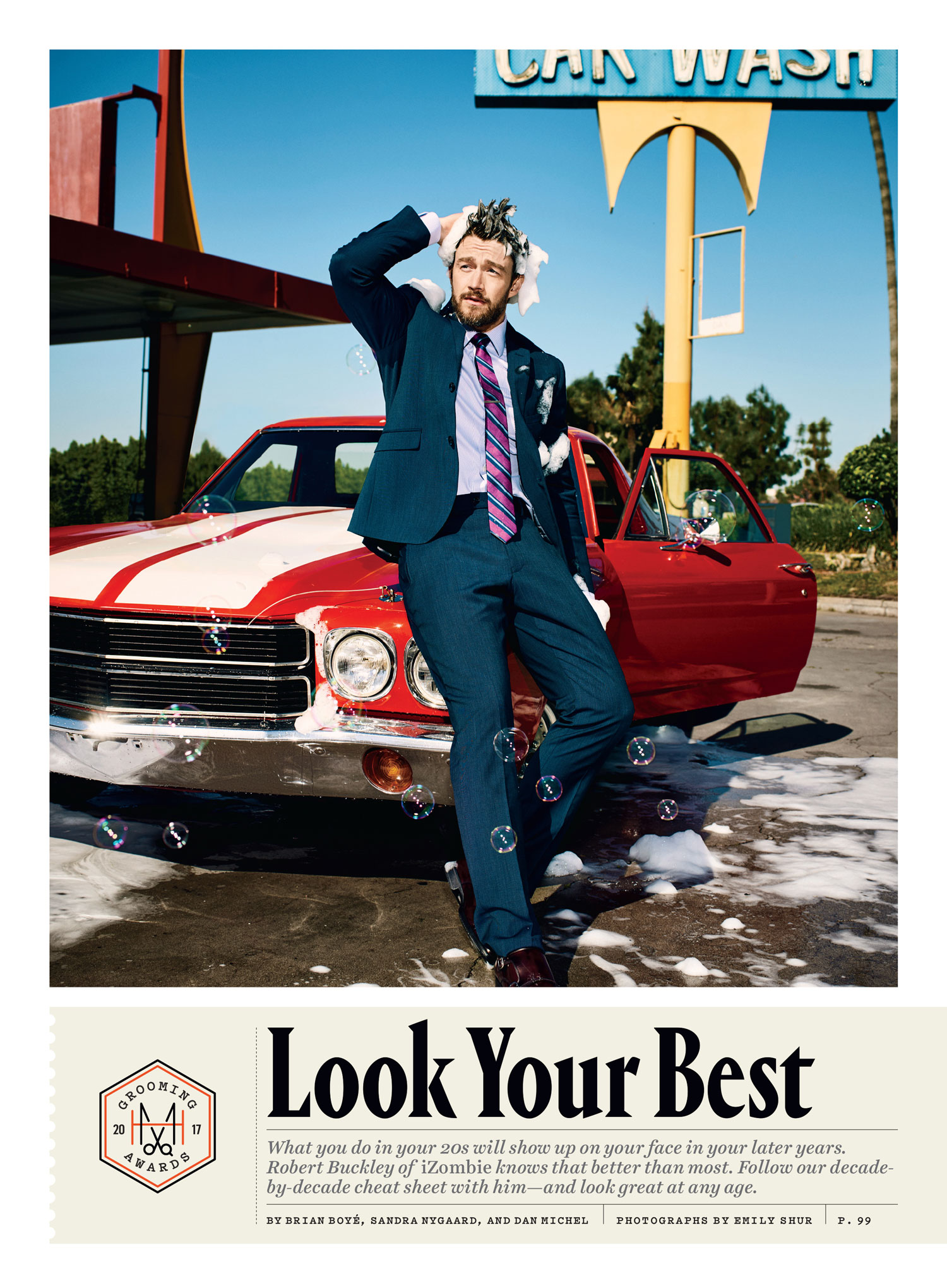
Let’s be honest, a guy can find a good workout online. I used reportage and environmental photography to bring him into the real world, to inspire him with something he can’t see elsewhere. I wanted the reader to envision himself as one of the heroes we feature, and see himself in scenarios that involve cooking, style, or any other service. But to punctuate these serious moments with notes of humor, because dudes still like to laugh.

Design
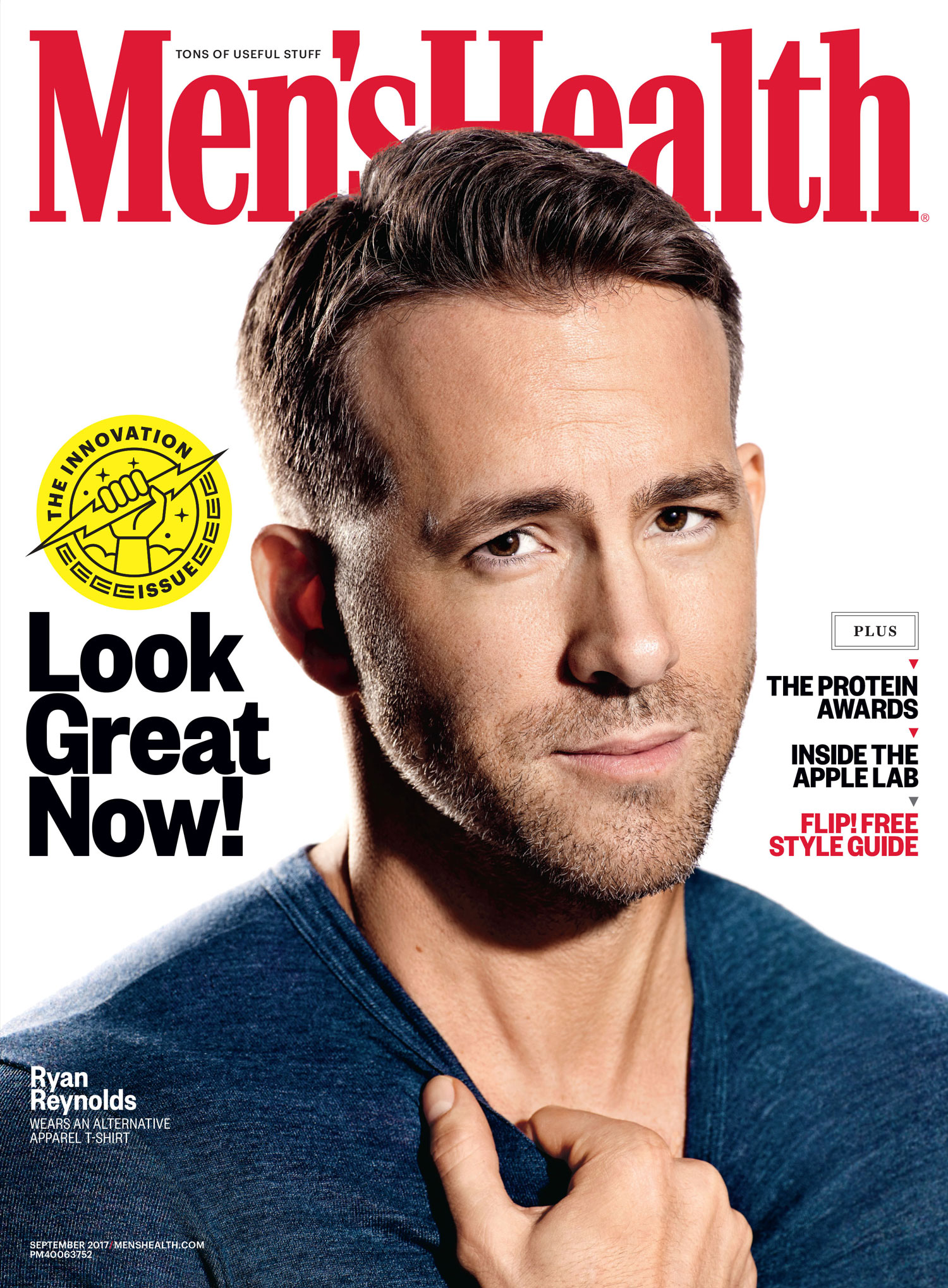
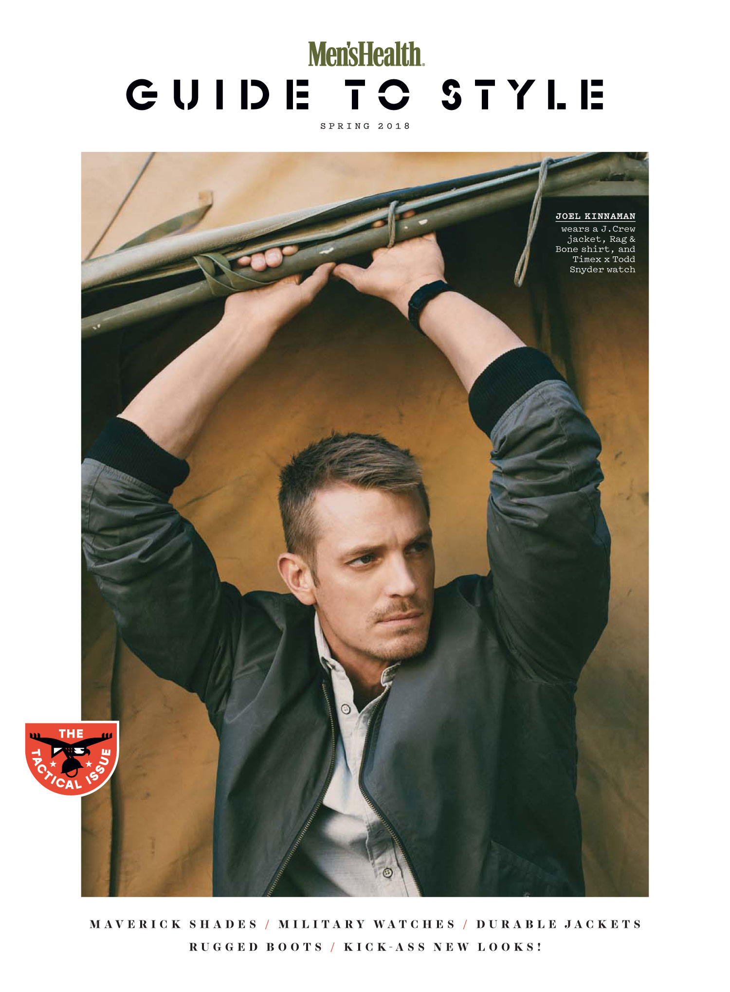
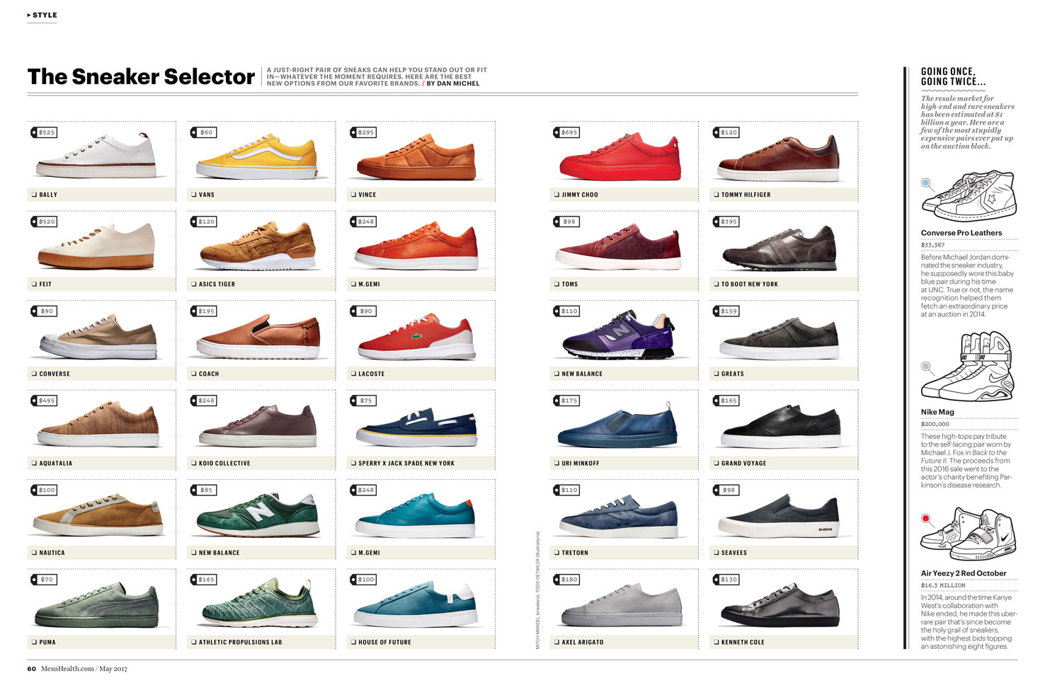
Given the exploding interest in heritage brands like Filson and Woolrich, it’s clear that design doesn’t need to be aggressive to appeal to a male audience. I shed the signature heavy rules and typography of men’s magazines, and built a sensitive design system using elements based off vintage ephemera. A rich design adds value to the purchase.

Illustration
The layer of illustration provides an additional value. I defined it’s function as two-fold: to inspire and instruct. The first goal is achieved through comic book style illustration, which alludes to the heroes many of our readers aspire to be. Secondarily, technical illustrations provide instruction on how perform many of life’s tasks.

Branding
Men’s Health has launched a series of franchises and themed issues, for which I provide creative direction on cross platform assets. I place a strong emphasis on consistent illustration style and color palette, given the need for these elements to be scalable.

MensHealth.com
Once we established the redesign, I moved on to guide a team to transition our new look to the website. We stripped out unnecessary clutter, established strict typographic guidelines, and deployed a few key design elements from our toolkit. The result: a more cohesive, smoother user experience.

Social Media
A single magazine page provides an exponential amount of content for social media– the smallest illustration can become it’s own post. I developed a visual strategy using a mix of existing and fresh visuals to ensure constant user engagement across all points of interest, including fitness, style, nutrition, and relationships.


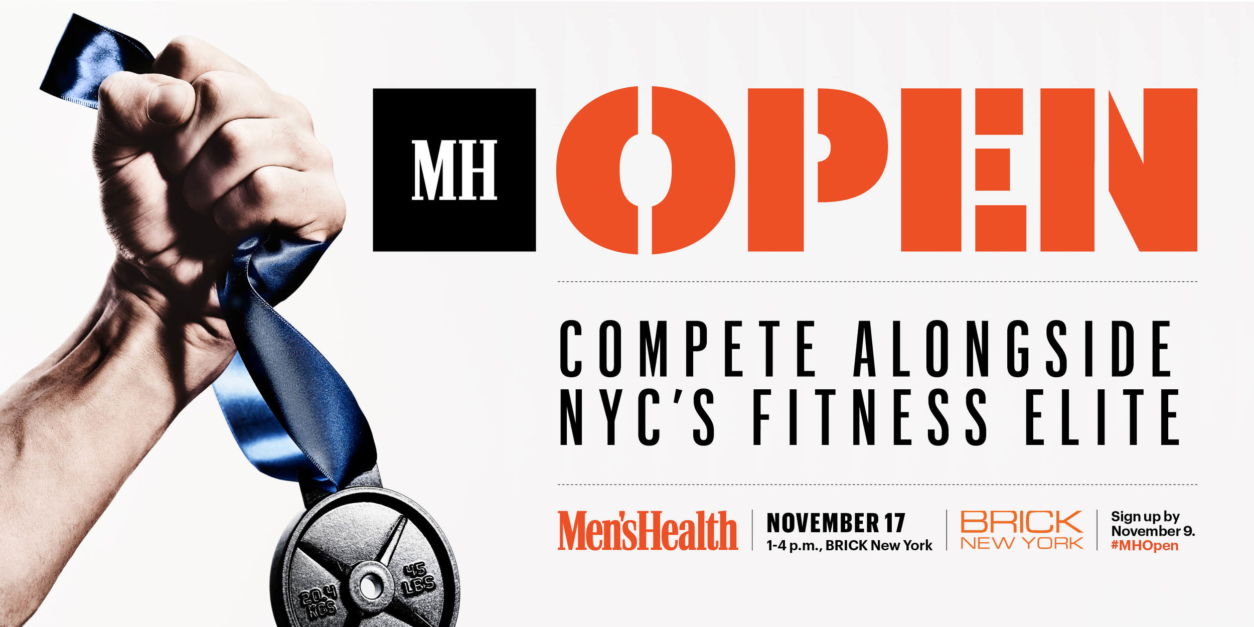
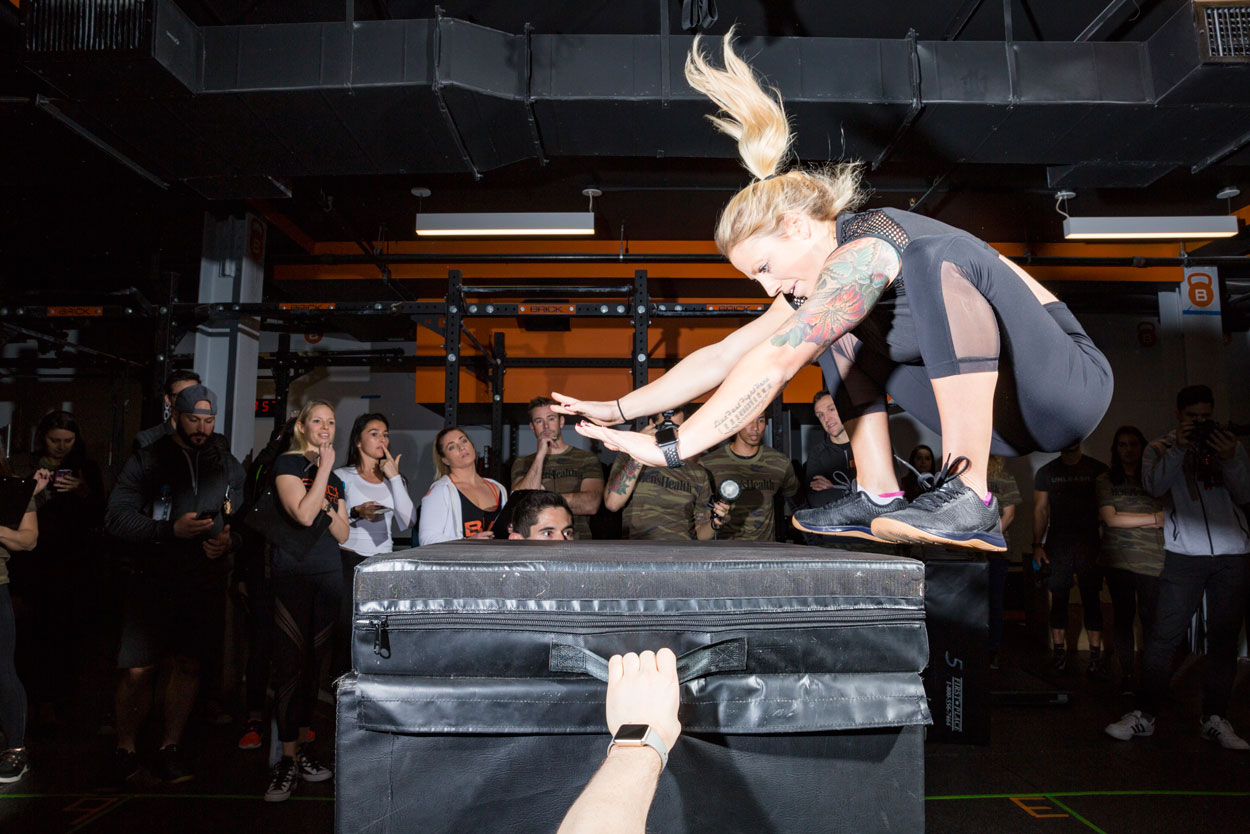
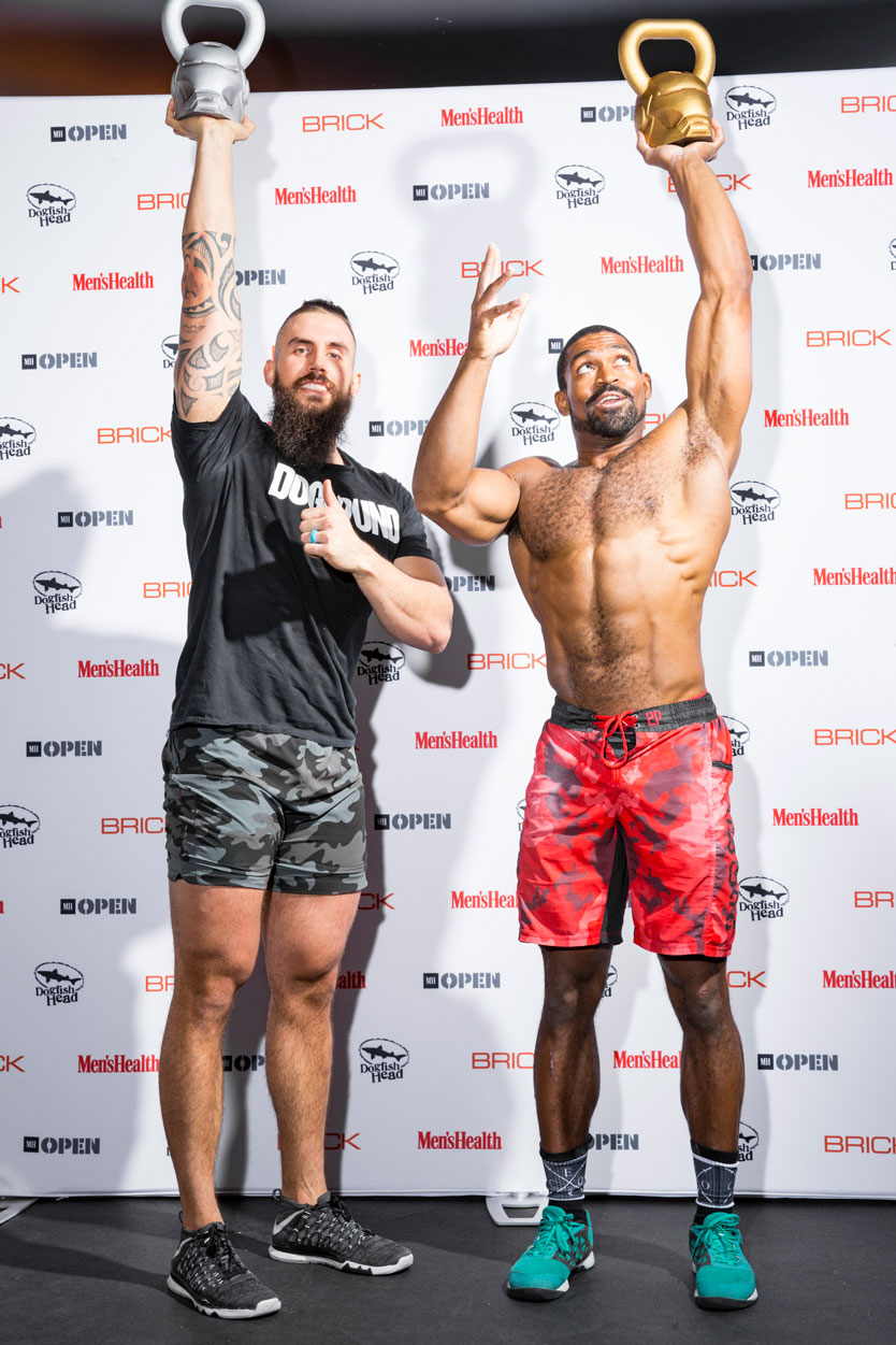
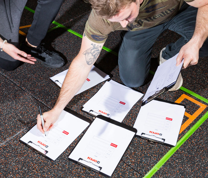
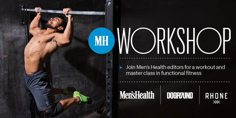
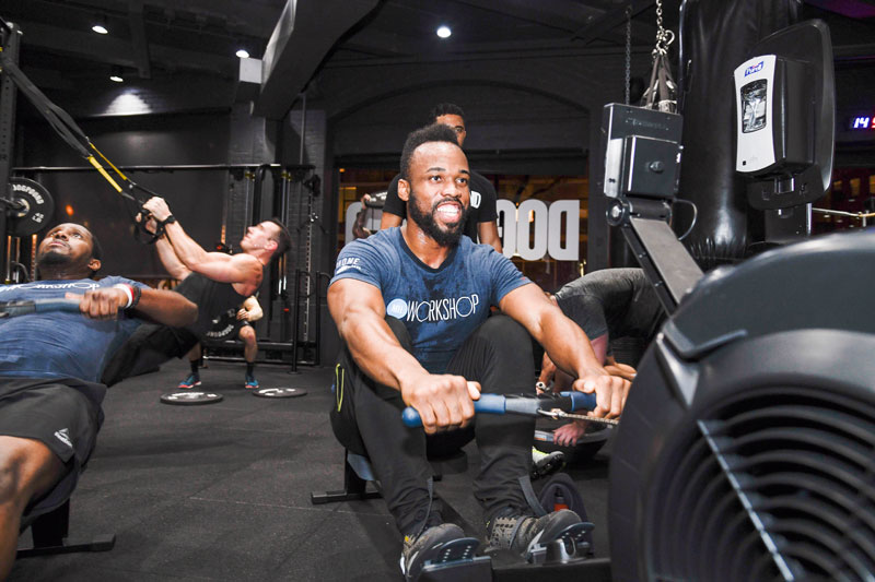
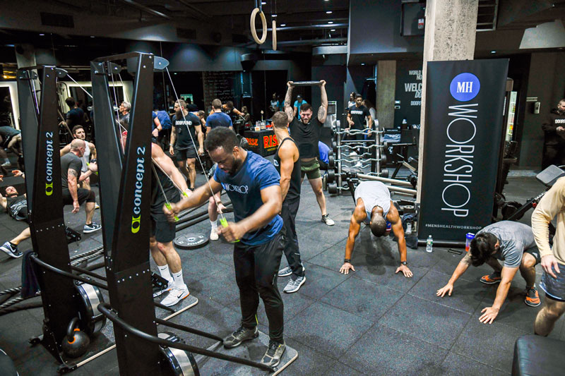
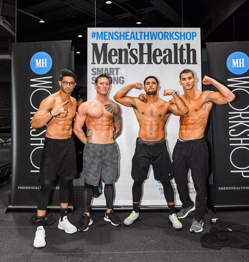
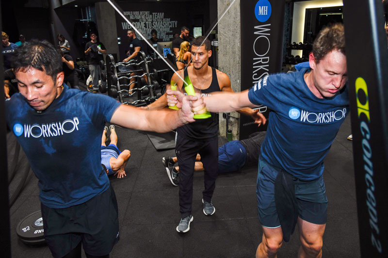
Events
Men’s Health has launched a series of events, for which I provided art direction on branding and invitation design, and also photography direction.

Apparel
I’ve extended the refreshed brand onto apparel, making use of reader’s favorite illustrations onto fresh designs.
