As Deputy Design Director of Popular Science and Popsci.com, I oversaw all things visual for the brand. That included a redesign of the website, magazine, and directing animations like these.
Animation by Michael Brandon Myers
Case study: Redesign
The problem: At the time, the publishing frequency of Popular Science shifted to 6x a year. Each issue needed to survive longer on newsstands and in reader’s homes. The solution: a redesign could make the magazine look and feel timeless.
Covers
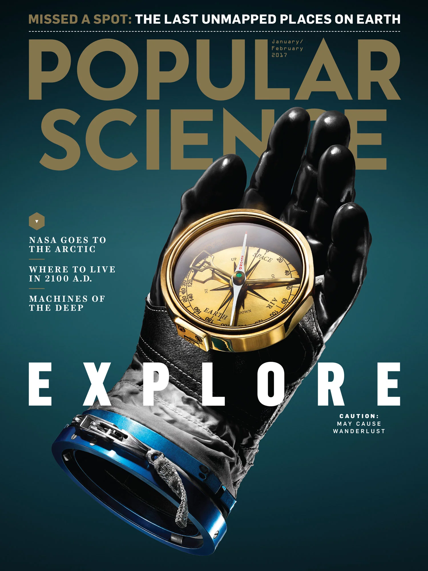
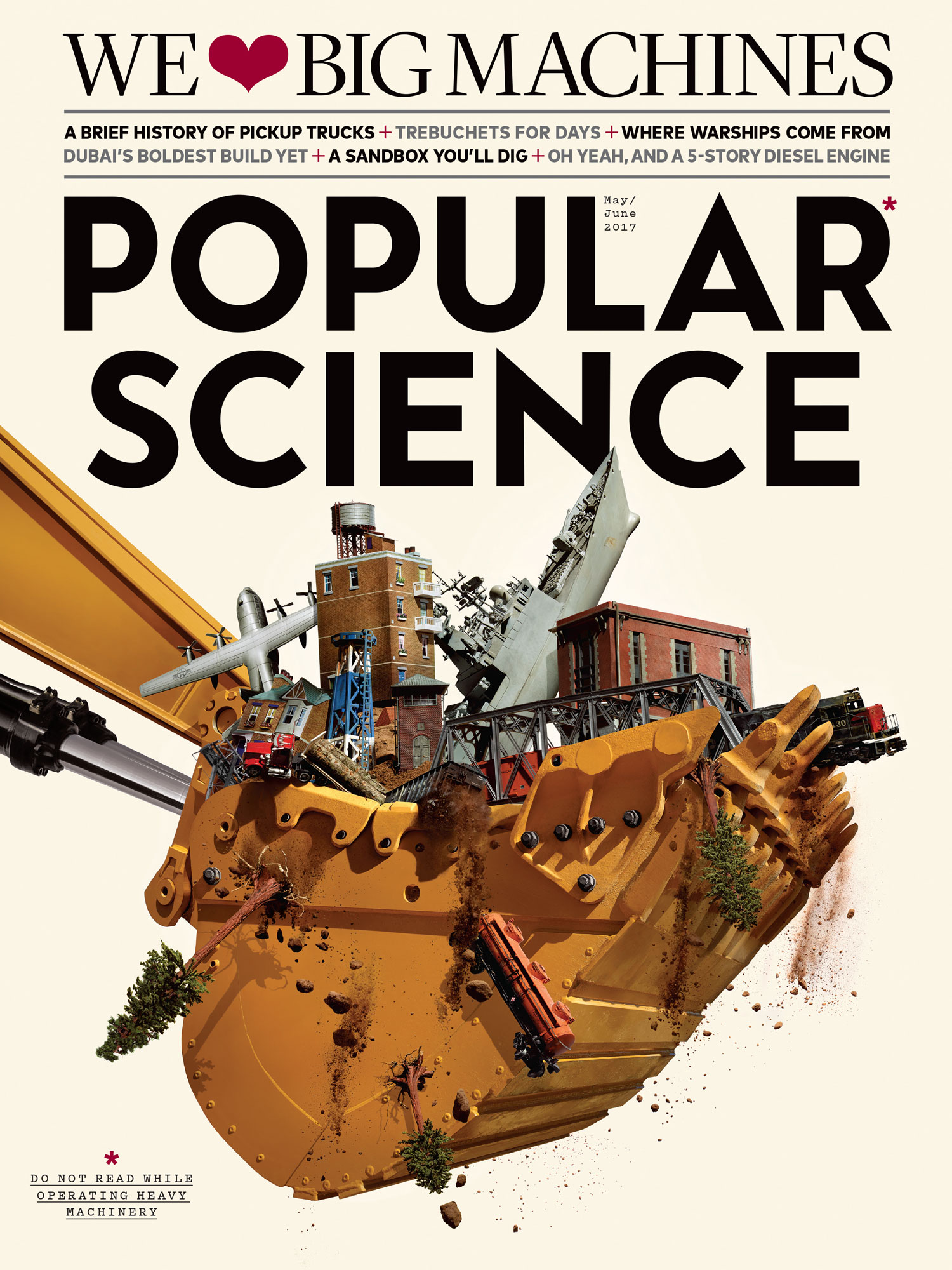
I wanted Popular Science to have the visual quality of a keepsake coffee table book. Working with photographer Adam Voorhes, my team created a conceptual image to sum up the issue’s theme, and paired it with simple, elegant design. With the right amount of consistency and variance, each issue felt like part of a series, encouraging readers to collect them.
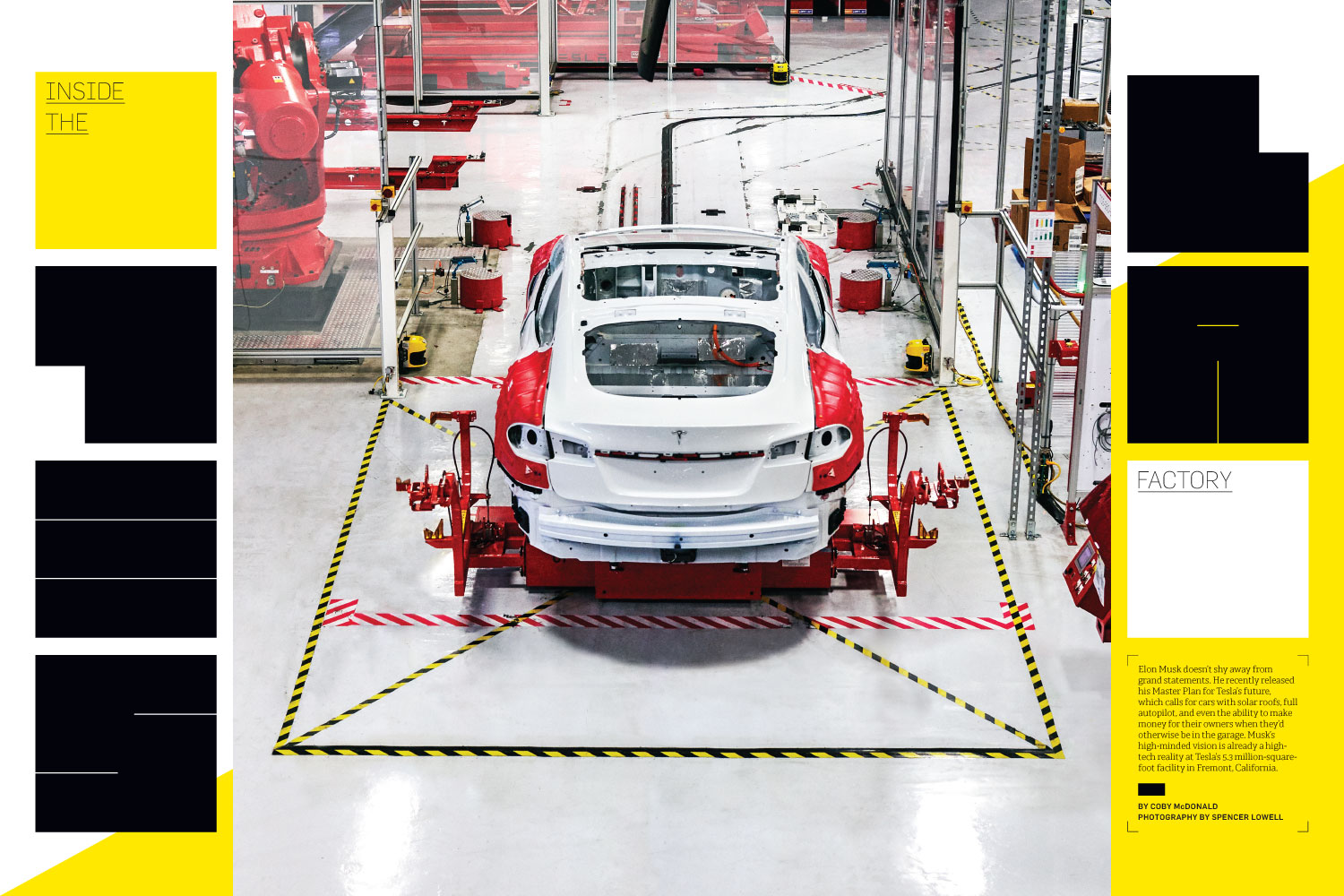
Design
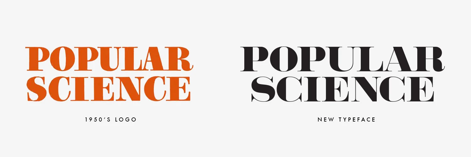
I wanted the magazine to look relevant in years to come, so I steered away from trendy design. Instead, I dug through the vast history of Popular Science, and came across a timeless logo from the 1950’s.
I found a contemporary typeface which paralleled that logo, and utilized it to define section names. From there, I developed a simple architecture for the pages–an invisible design that would allow the content to shine.
Infographics
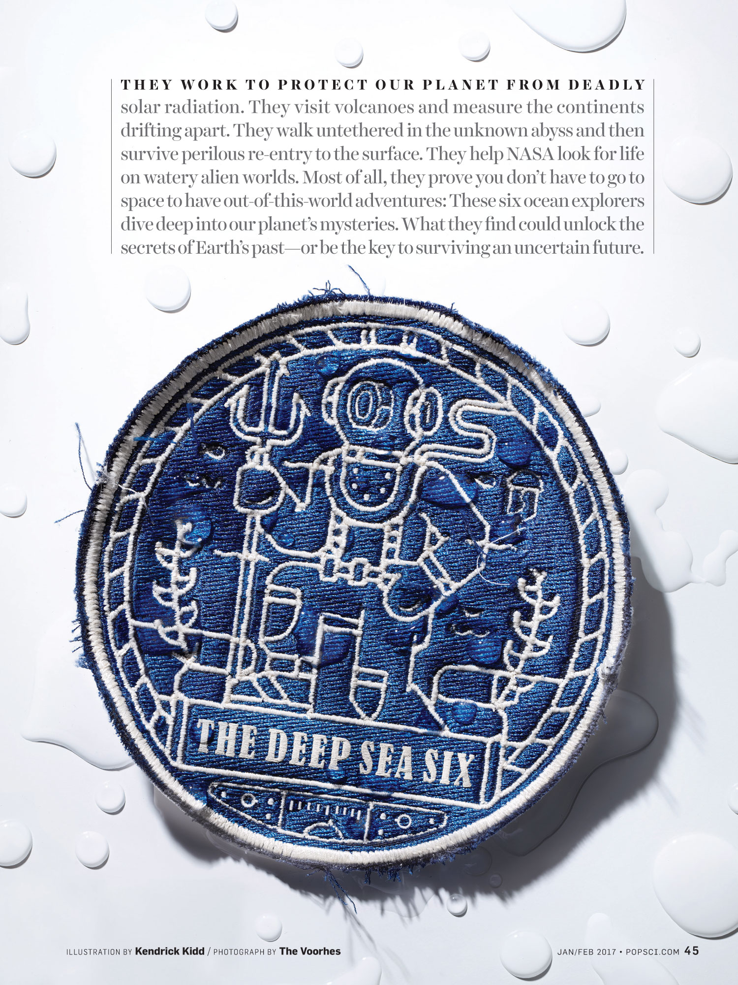
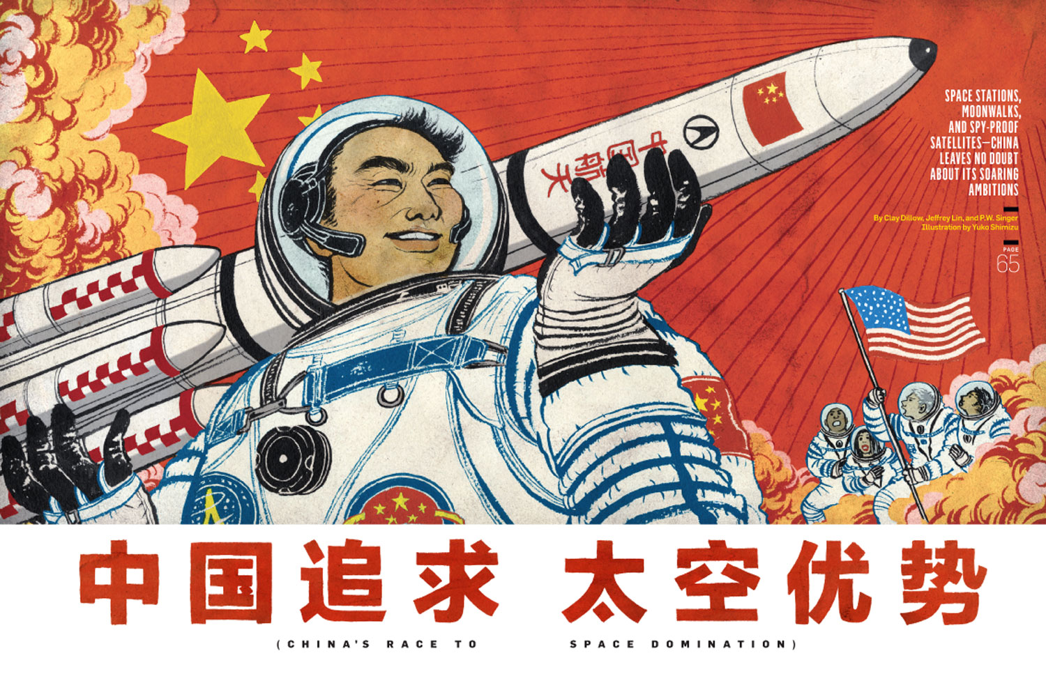
Visual information is the bread and butter to PopSci readers, and I wanted our infographics to feel like collectible pieces of art. In order to add value, I developed a concept for each, and found a surprising illustrator or even a photographer to execute the idea.
These infographics were collected in a new section titled “Charted”. I also built the section’s logo into each infographic, thus adding an additional Easter egg moment for the reader. The more layered the visuals, the more reason a reader has to retain his/her copies.
Photography
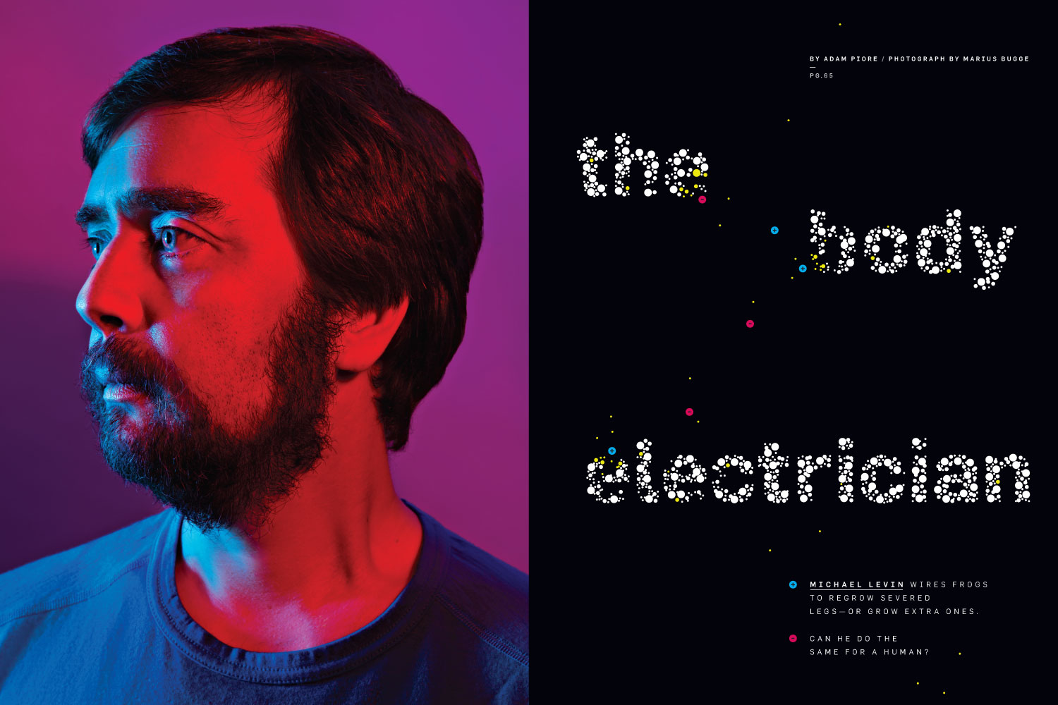
When a new issue hit newsstands, I wanted it to look distinctly different than the previous one. Photography was a way to give each issue an identity. Based on the editorial theme, I developed guidelines for color palette, texture, and lighting, which together created a visual conceit. All issues were unified through graphic simplicity, which never goes out of style.


